Creating a website pricing page that converts isn’t just about listing numbers. It’s about making it clear, transparent, and easy to compare. When customers understand exactly what they’re getting, they feel more confident in making a decision. Avoid hidden fees, use straightforward descriptions, and highlight key benefits so pricing is easy to grasp at a glance. A simple, well-structured pricing page not only enhances the user experience but also increases conversions by removing friction and uncertainty.
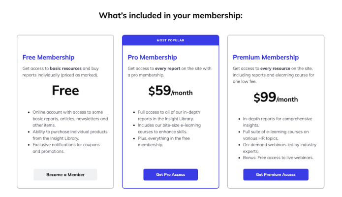
1. Keep pricing simple and easy to choose
Too many choices can be overwhelming. When customers face a long list of pricing options, they might hesitate or abandon your site. Keep things simple by offering just two or three well-defined plans that cater to different needs.
Give each plan a clear, easy-to-understand name like Basic, Pro, and Premium so customers can quickly see the differences. Make sure each plan highlights what sets it apart, so it’s obvious which one is the best fit.
Nudge customers toward the best option. Add a bold, colored frame around the recommended plan and label it "Most Popular" or "Best Value." This small visual cue helps guide customers toward the ideal choice without overwhelming them.
By keeping pricing clear and visually intuitive, you make it easier for customers to decide to subscribe.
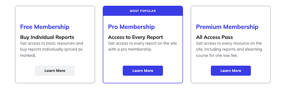
2. Make choosing a pricing plan easy
Picking the right plan shouldn’t feel like a puzzle. Help customers quickly see which option fits them best by clearly stating who each plan is for and what they’ll get. A simple, one-line description for each tier goes a long way in guiding their decision.
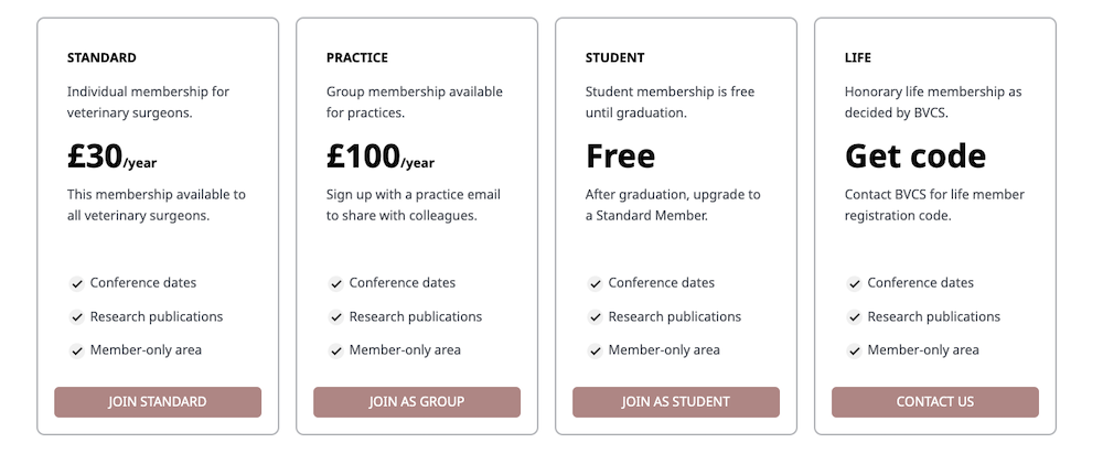
Use visuals to break things down with:
- Checkmarks next to each feature to highlight what’s included
- A side-by-side comparison table for quick scanning
- Short, benefit-focused descriptions so customers instantly see the value
With a visually intuitive design, you eliminate confusion, build confidence, and help customers feel great about their choice.
3. Offer a risk free trial
One of the best ways to build trust and ease any doubts is by offering a risk-free trial - whether it’s 7 days or 30 days. This gives potential customers a chance to test out your service without any commitment upfront. They can experience the value for themselves and see if it’s a good fit. They get a chance to experience the value firsthand before making any long-term decisions.
Benefits of a free trial:
- Builds customer confidence
- Increases conversions
- Reduces buyer's remorse
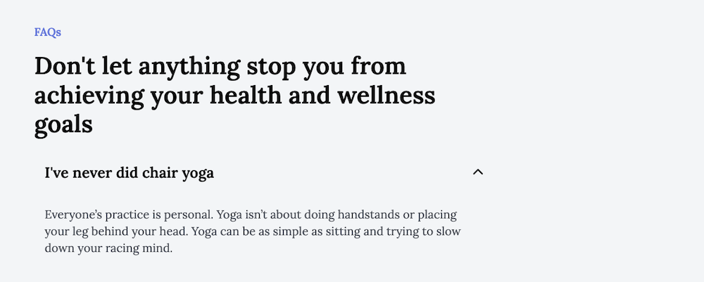
4. Build trust with a helpful FAQ section
We all have questions before making a purchase - whether it’s about pricing, features or refunds. Proactively addressing common concerns with a FAQ section can help reduce customer hesitation.
Here’s how to make your FAQ section helpful:
- Use clear concise language
- Use an accordion design to keep the page clean while letting users find answers quickly
- Address objections proactively like cancellation policies
5. Make your call-to-action buttons clear
Your CTA button should be easy to act on. Make it bold and action-driven with phrases like "Join Now," "Start Your Free Trial," or "Sign Up Today." These clear, direct messages prompt visitors to take the next step without hesitation.
Sprinkle your CTA buttons throughout your page, especially after key sections. So no matter where visitors are in their decision-making process, they always know what to do next.
Final thoughts
A great pricing page does more than just display numbers. It guides customers toward the right choice with clarity and confidence. By keeping pricing transparent and easy to compare, you make the decision process simple and stress-free. Focus on clear descriptions, intuitive design and a frictionless experience and you’ll create a pricing page that not only informs but also drives action.